Symbol

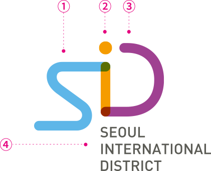
Expresses the image of global business communication and exchange through organically connected different colored lines
Various design systems can be developed using combinations of color and line motifs
- Organic Line
Expresses vigorous flow of international exchange/communication and smooth movement of people
- Multy-Color Line
Expresses organic connection of different complex activities like international business and entertainment
- Color Code
Colors representing keywords of future, vitality, and synergy
Primary Logo
Basic logo representing SID externally. Principle to use this logo in all situations
-
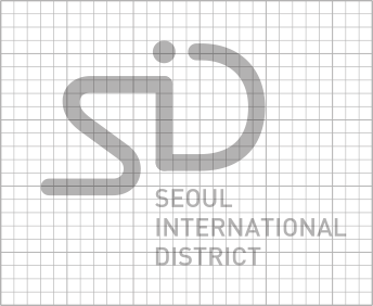
GRID
-
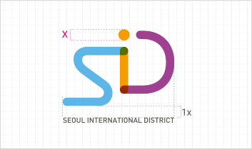
Clear Space
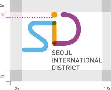
- Securing clear space
- To ensure proper delivery of the primary logo's form,
minimum clear space must be secured around
the logo where no other elements can intrude.
Clear space regulations follow the contents of this chapter.
Logotype
Letter-type design expressing SID. Can be used in situations requiring text-only SID expression
-
English logotype

-
Korean logotype

Slogan
Basic slogan of SID. Please follow regulations specified in this chapter when combining with SID logo
-
Horizontal Combinations

-
Vertical Combinations

Signature
Basic combination regulations for using slogan with SID logo. Recommended to apply based on spacing specified in manual
Slogan Combination Display Regulations A
-
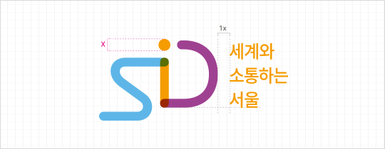 Left-right slogan combination
 -
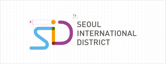 Left-right English logotype combination
 -
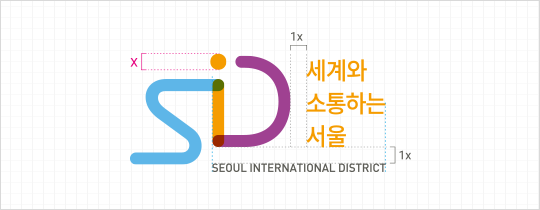 Left-right slogan/English logotype combination
 -
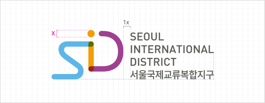 Left-right English/Korean logotype combination
Slogan Combination Display Regulations B
-
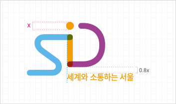 Top-bottom slogan combination A
 -
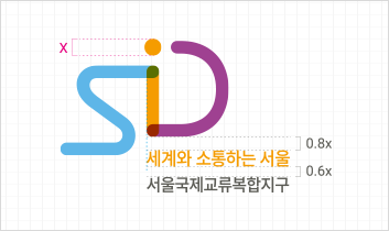 Top-bottom slogan/Korean logotype combination A
 -
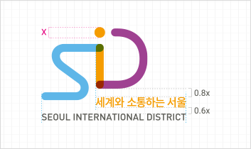 Top-bottom slogan/English logotype combination
 -
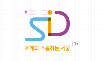 Top-bottom slogan combination B
 -
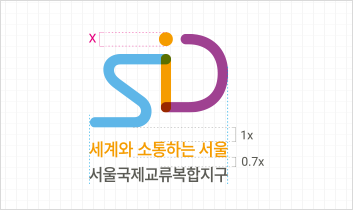 Top-bottom slogan/Korean logotype combination B
 -
 Top-bottom English logotype combination
 -
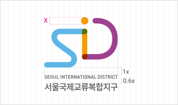 Top-bottom English/Korean logotype combination
Color
Color Palette - Basic Colors
Following the specified color standards for consistent SID expression. Requires management to minimize variations that may occur depending on implementation materials
- Tomorrow
- SID Blue, reminiscent of Seoul's blue sky and Han River, symbolizes a bright future
A color containing the hopeful tomorrow brought by future growth engines
- Energy
- SID Orange captures the energy and vitality created by newly established industrial and cultural infrastructure
A color symbolizing the vigorous energy and joy to be shared by the entire city.
- Synergy
- SID Purple symbolizes harmony and synergy between industries
and nations at the center of international exchange and communication
A color representing the site of international exchange and its achievements
- Infrastructure
- SID Gray, serving as both secondary and text color, is Seoul's 'tile gray' expressing
SID's existence as infrastructure of facilities and culture created by Seoul
- Panton 2171 C C61 M11 Y0 K0 R95 G183 B231 #5fb7e7
- Panton 1375 C C0 M45 Y100 K0 R245 G156 B0 #f59c00
- Panton 513 C C45 M85 Y0 K0 R159 G64 B145 #9f4091
- Panton 418 C C66 M55 Y60 K28 R90 G91 B84 #5a5b54
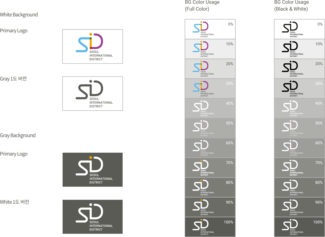
Background Color Usage Guidelines
SSpecifying color regulations according to background colors to ensure SID design is visible on any background
White is the most appropriate background color for logo expression. When the logo is used in monochrome according to usage environment, media, and purpose, use background colors that satisfy excellent readability conditions as exemplified below. Please consult with the management department if standards other than those presented are needed.
