Introduction to BI

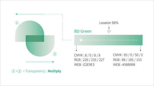
The Balanced Development Policy Division's brand symbol logo expresses the concept of balanced development for shared happiness by combining two symbolic forms representing smiling faces expressing happiness together.
The logo symbolically represents the vision of the Balanced Development Policy Division to create an attractive Seoul with equal opportunities through balanced development between Gangnam and Gangbuk, achieved by combining smiling faces in a symmetrical arrangement facing each other, creating a balanced straight line in the center.
Basic Combinations
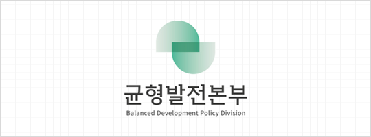 Vertical Basic Combination
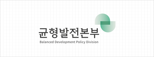 Horizontal Basic Combination
Basic Combinations

The Balanced Development Policy Division emblem can serve as a seal that can be used on signs and documents in place of the symbol logo. To maintain image consistency, the symbol logo's proportions and construction cannot be arbitrarily modified, and it must be used according to the provided proportion guidelines.
Brand Main Color Guidelines
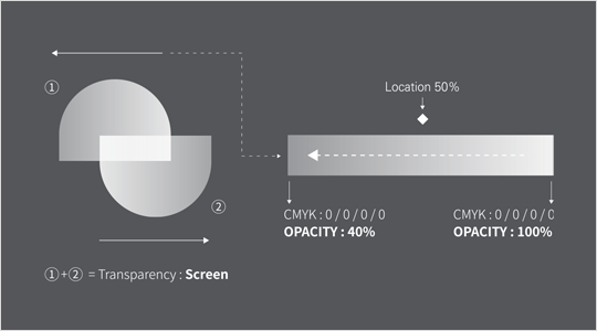
The Balanced Development Policy Division's brand colors are a key element of the brand, playing an important role in forming and conveying the brand image from the symbol logo's display colors to various application items. Brand colors are used maintaining precise color, brightness, and saturation as one of the basic systems representing the brand's character.
Brand Usage Restrictions
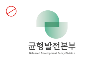 Cases where symbol logo proportions are incorrect
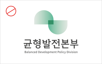 Cases where symbol shape is distorted
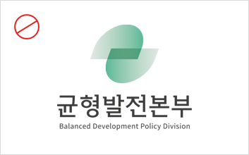 Cases where symbol logo is tilted우
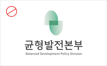 Cases where symbol shape is altered
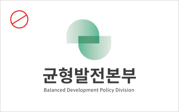 Cases where logo font is arbitrarily changed
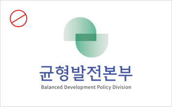 Cases where logo colors are arbitrarily changed
The Balanced Development Policy Division emblem can serve as a seal that can be used on signs and documents in place of the symbol logo.
To maintain image consistency, the symbol logo's proportions and construction cannot be arbitrarily modified, and it must be used according to the provided proportion guidelines.

